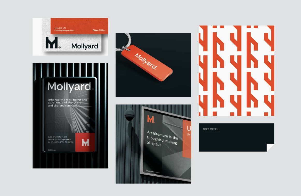
Mollyard is a conceptual architecture brand developed as part of our internal exploration into how modern design and construction companies can express depth, structure, and innovation through visual identity. The goal was to create a visual language that feels architectural in itself, bold, balanced, and rooted in the materials and geometry that define great spaces.

In the architecture and construction world, most visual identities default to minimal black-and-white grids or sterile typography. The industry often under-communicates its own artistry. We wanted to challenge that norm by designing a system that captures both the craft and the confidence of modern architecture, something that feels engineered yet distinctly human.
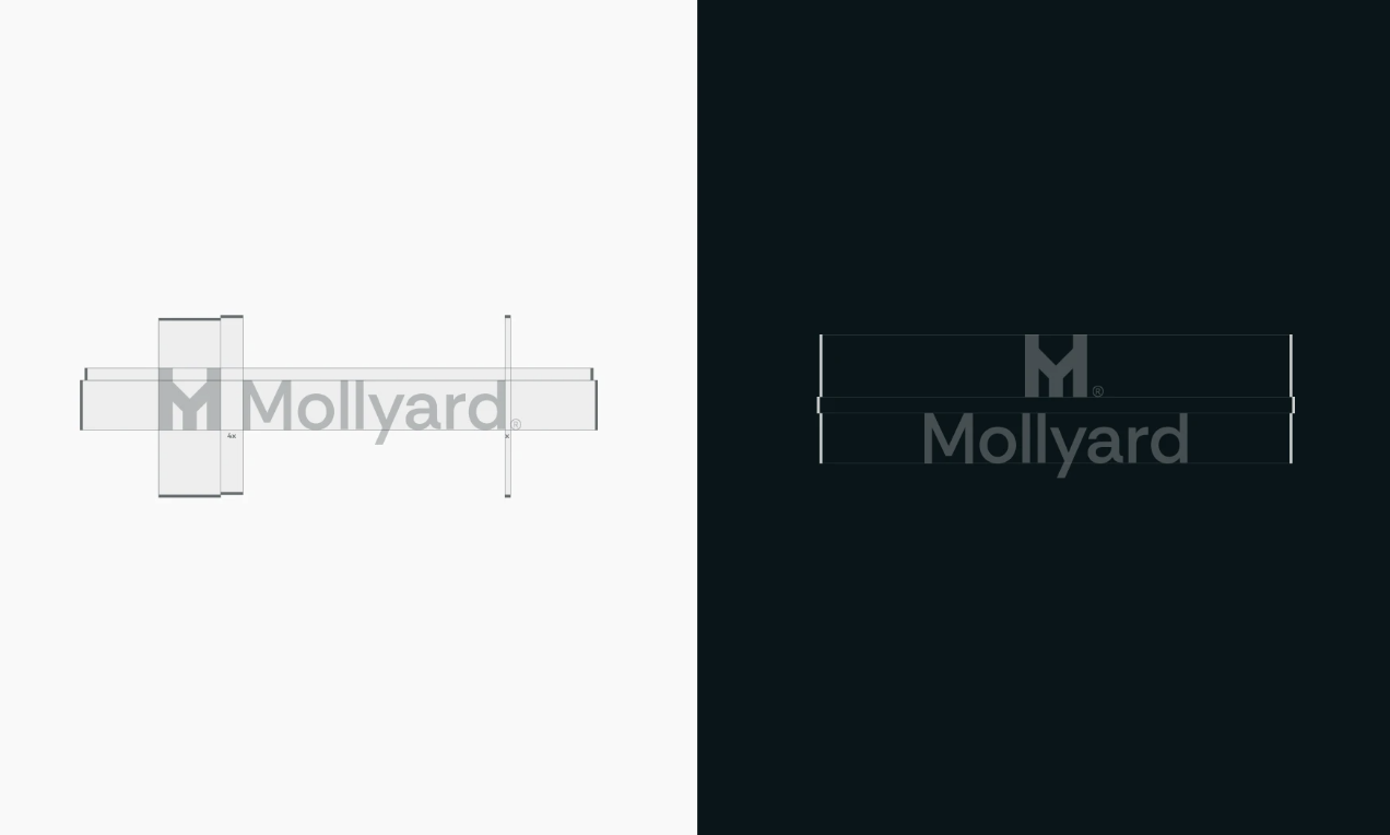
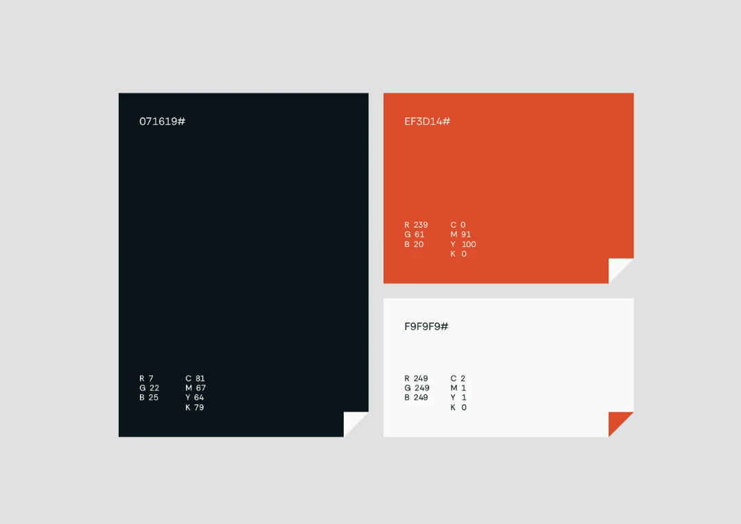
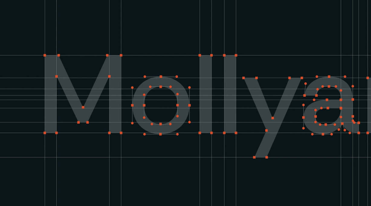
We started by defining the creative foundation: architecture as the thoughtful making of space. From there, we built the Mollyard identity around alignment, contrast, and texture. The logomark merges the strength of the letter “M” with structural symmetry inspired by construction beams and floor plans. The color palette combines Deep Green (stability, foundation) and Burnt Orange (energy, texture), while Rethink Sans provides a clean, geometric typographic system that scales across print and digital. The entire design system, logo grid, stationery, and environmental applications, was crafted to feel as precise as a technical drawing but as emotive as architectural light and shadow. Every detail was engineered to express the tactile intelligence behind the brand’s ethos: Unleash the Texture.


The Mollyard identity showcases how a construction-focused brand can look premium without losing authenticity. It demonstrates the potential for architecture firms to build brands that are both technically refined and emotionally resonant. This project is part of MORR’s ongoing creative research initiative, developing internal concepts that test, refine, and elevate how we approach brand systems across industries.